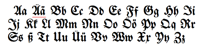
1. Lowercase k and t
The lowercase “k” and “t” can very much resemble one another. The top part of both letters leans slightly to the right, and they both have a horizontal line in their middle.
However, the “k” has an extra diagonal line between the top and middle line, whereas the “t” does not. The middle of the “t” is also crossed all the way through, while the horizontal line of the “k” is simply on the right side of the letter and does not extend through the middle.
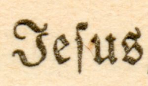
2. Lowercase s and f
The “s” and the “f” can look very similar in Fraktur. They both extend below the line, and the top of each letter extends horizontally to the right.
The “f”, however, is fully crossed in its middle, while the “s” only has a slight protrusion on its left.
3. Lowercase s and s
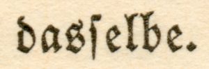
4. ß and Lowercase tz
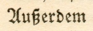
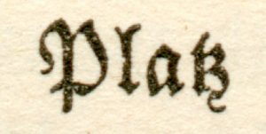
The “ß” and “tz” can look very similar to one another in Fraktur, as they both have two loops coming off a straight left side. Remember that the “t” however, leans only slightly to the right at the top, while the top of the “ß” extends farther to the right. The “z” of the “tz” will also usually have a tail at the bottom, while the “ß” does not.
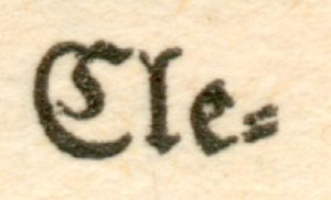
5. Capital C and E

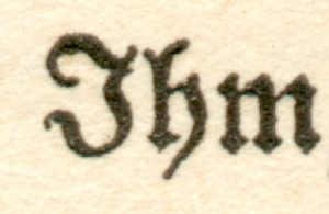
5. Capital I and J
2 Responses
I do not know German. How do I find someone who can translate a document that is in “old German”? Thank you. I have it all scanned into my computer. The date is 1784 and the names are George and Anna Martin. Thank you.
Send it over to us and we’ll give you a quote: admin@germanologyunlocked.com